Earlier today the Church released details of the remodel of the Hong Kong China Temple, currently in progress. The Renovation is going to include the standard changes and upgrades to the mechanical, electrical, heating and plumbing systems. (At Jordan River and Washington D.C. temples, all interior walls were removed, so that plumbing and electrical could be replaced. I would suppose the same will happen here as well.)
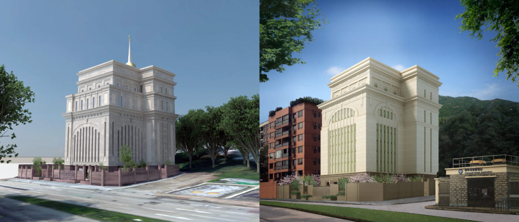
Besides including a few renders of the primary interior rooms, there was a new exterior render for the temple as well. Surprisingly, the exterior is going to get quite the overhaul.
I have been in the habit of reviewing temple changes and de3tails with some good friends by email. Today I thought I might try making that conversation public, to see if anyone else is interested.
Spire
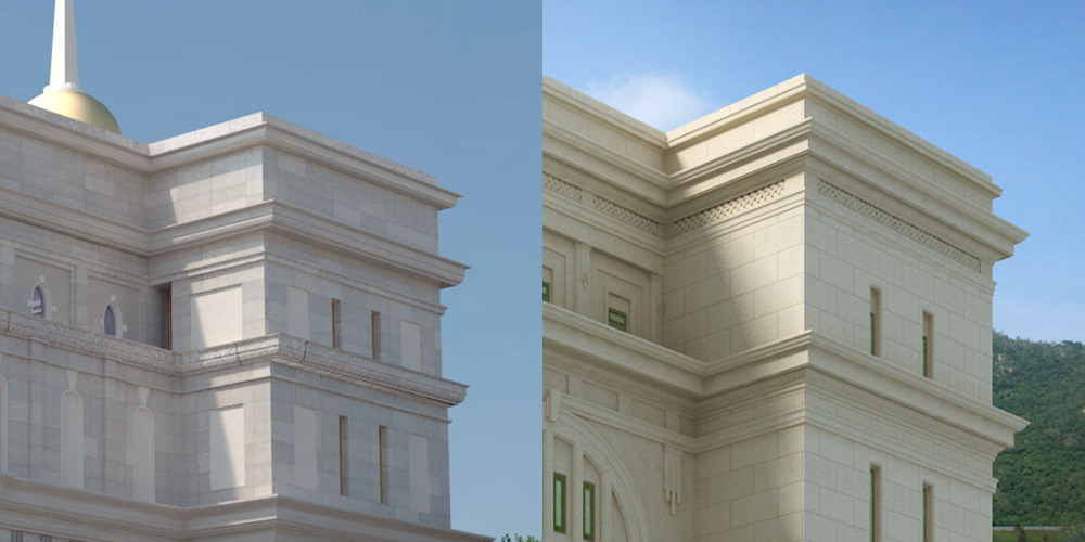
First, foremost, and most noticeable to me, is the removal of the spire:
This is the first time that an Angel Statue has ever been removed from a temple that used to have one. These days we are more used to seeing the reverse. With the recent trend of more and more temples being built without, this marks a definite change in design principles. The statues have come to act as a sort of identifier or branding, to denote an easily recognizable Temple of The Church of Jesus Christ of Latter-day Saints. Perhaps this is no longer the case.
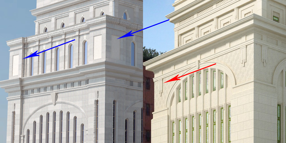
Top Floor
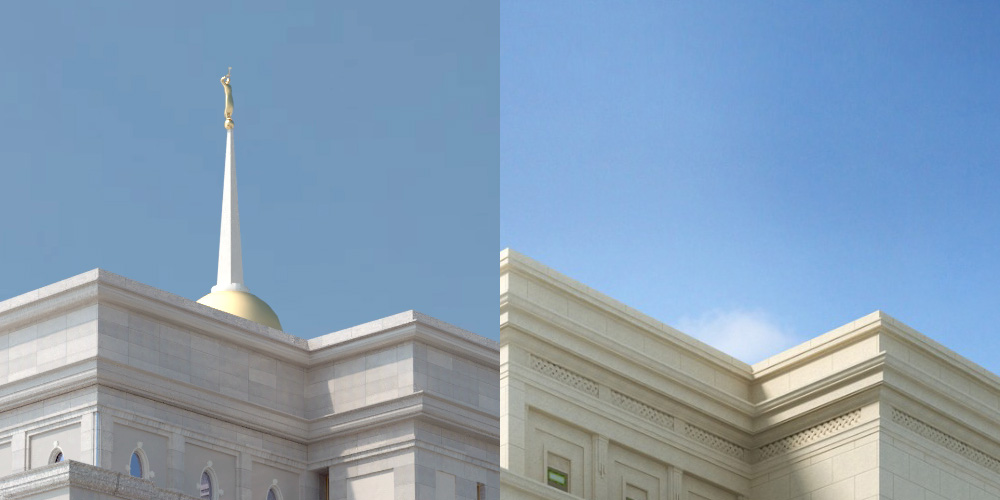
Now lets look at the top story of the temple, a floor that is smaller in the front section than the rest of the temple.
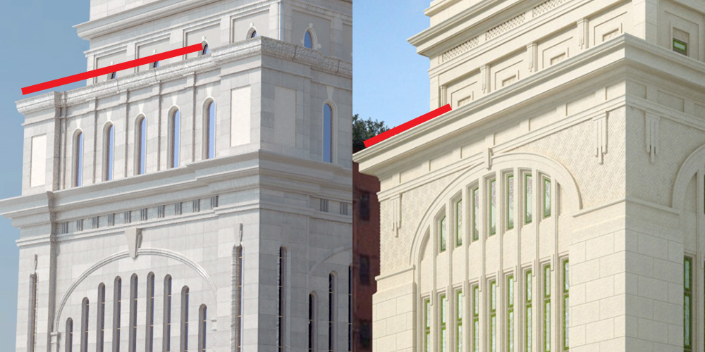
The cornice trim at the very top of the temple is now smaller:
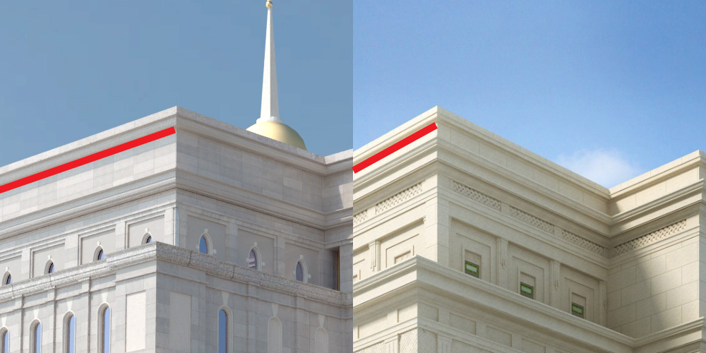
While the lower cornice trim gets a bit bigger and moves up:
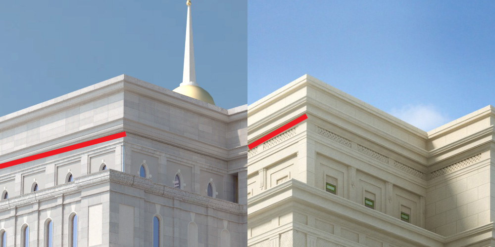
The effect is that the upper story of windows looks less crowded, though they don’t move at all. The whole feel of the upper level is more inline with what little I know about classical design proportions, and makes the space feel more pleasant and well designed.
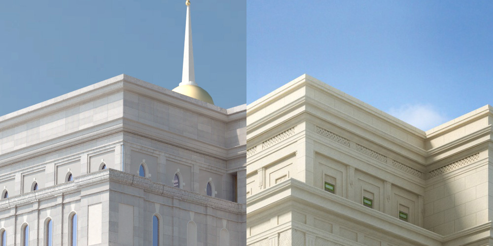
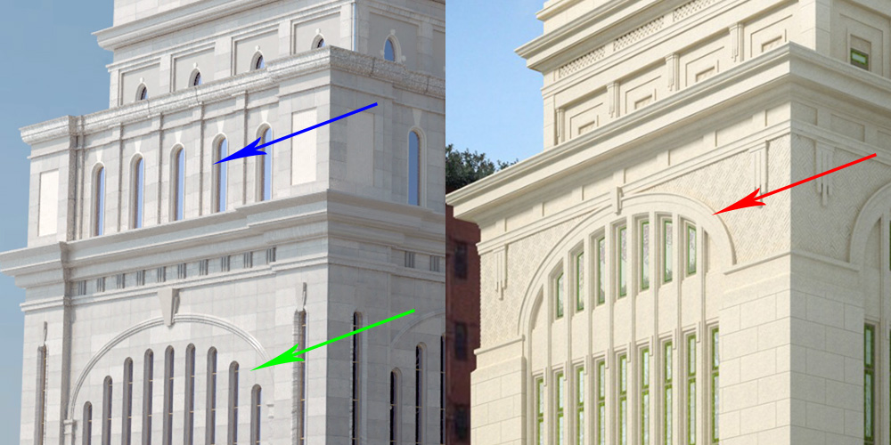
They do change from oval windows to square, and the trim work between them and the crown molding gets taller with a decorative woven design (blue arrow).
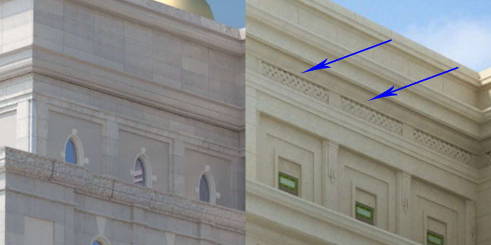
The pilasters between the upper story windows get (red arrow) more prominent, with a triglyph pattern (green arrows.)
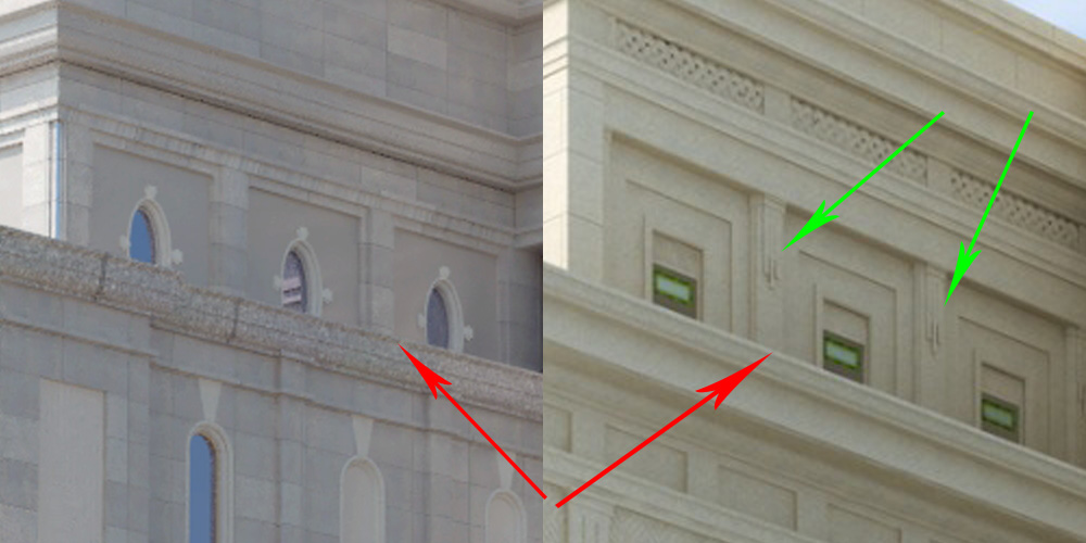
That triglyph pattern will show up elsewhere on the new temple exterior.
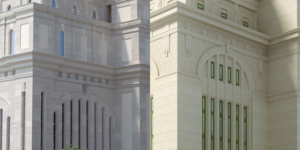
On that same level, the current temple has this recessed nook with a window, that is now closed off and added tot he square footage of the floor:
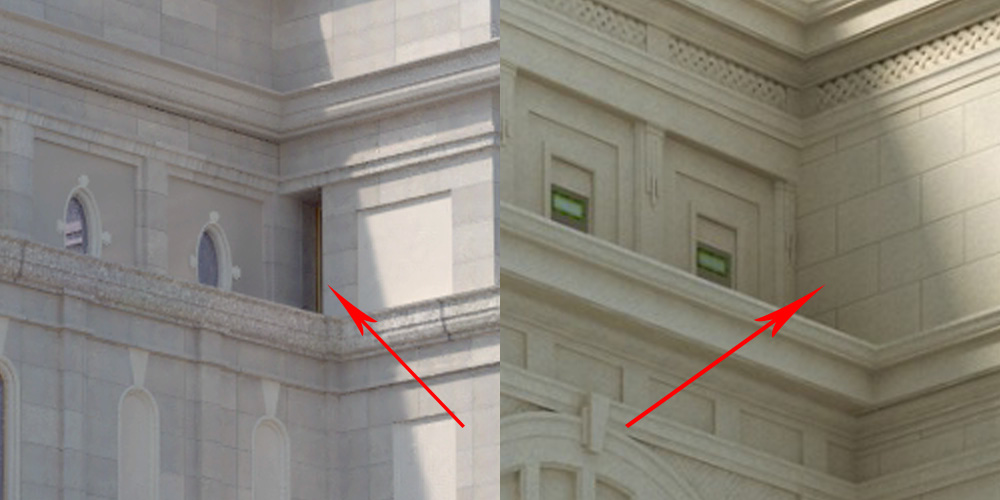
Moving to the back end of the temple, I would ask you to ignore my errors on my model (the before image on the left.) I miss get some things wrong, but for this purpose it still works. The back end of the temple gets a much more simplified look. Inset panels of stonework are now going away, leading to flush walls instead. This draws attention away from the rear of the temple and moves it back towards the front. It also makes the back section look more like a separate tower, and gives it a taller feel.
Fourth Floor
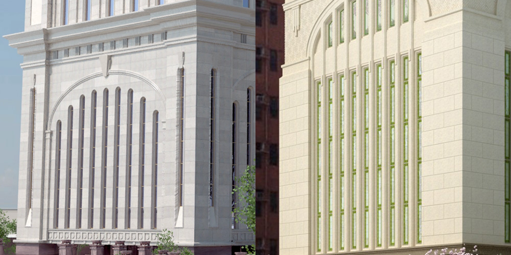
As we move down the temple, while the temple itself becomes a little less complex, the differences become more pronounced.
First, the cornice at the top of the temple is larger, has been squared, and is more appropriate to a classically proportioned building:
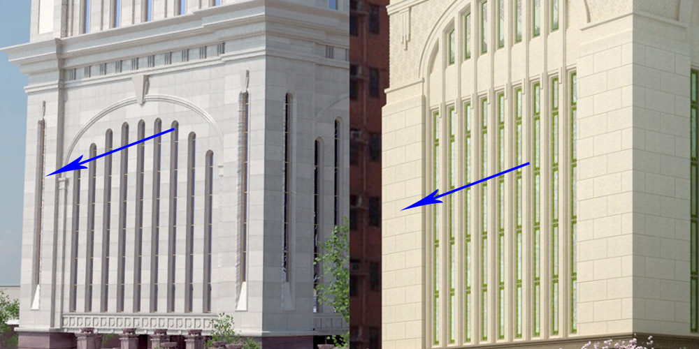
Next to notice is that the arched windows of the old celestial room (blue arrow) are gone. Now there are a series of narrow windows, the tops of which have collectively been cut into an arch, with an accompanying trim and pilasters separating each band of glass. (red arrow) On the Church’s newsroom article you can see an interior render of the celestial room showing that these windows are still the Celestial room, just with a new look. This new arched window mimics the older, lower arched windows that used to be part of the chapel floors of the original design (green arrow.)
The arched window section does keep the keystone feature the temple currently has. It also is bordered on either side by a woven pattern, different from the pattern above the fifth floor windows. (underneath red arrow above.)
The temple currently has small tower like structures (blue arrow.) these are removed from the new design. At the top of where these used to be are new triglyph features (red arrow.)
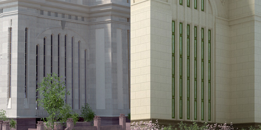
The side section of the front of the temple gets the same design changes the front side did:
While the tower at the back of the temple maintains the new simplified form shown on the top level.
Third and Second Floors
Moving down another story, at the top of the third floor we find that the belt cornice has been completely reduced to a small section that sticks out with a large flat section underneath. While this provides to break up the space in much the same way it did before, it does not separate the section so severely. The Third and fourth floors now look more like they are part of the same level of the building. This makes the hole temple feel a little taller, despite being the same size.
Also of note, the corner tower structures have been eliminated down here, as have the corner windows and keystones that were in them. This makes the lower sections of the temple appear less complex than before:
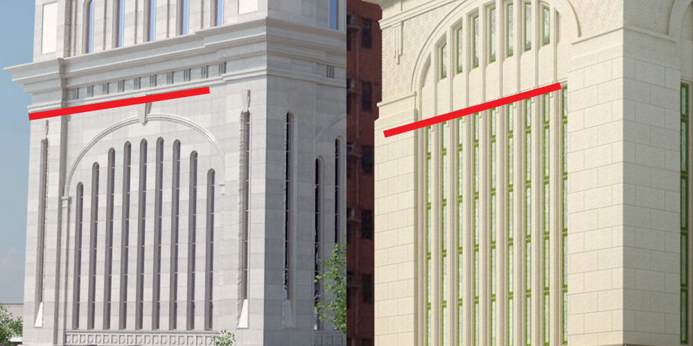
It’s interesting to note that while the front face, before and after, has 9 strips of windows:
The side section has been reduced from 8 strips of glass to 6:
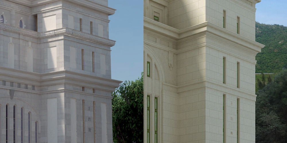
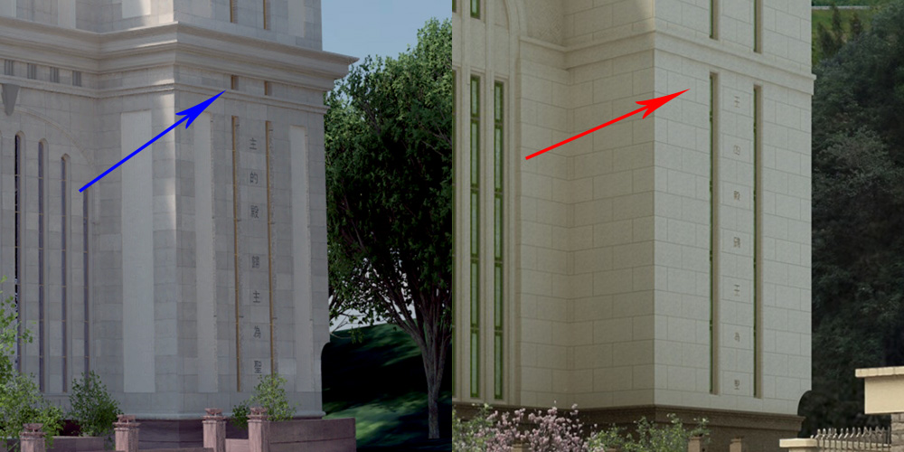
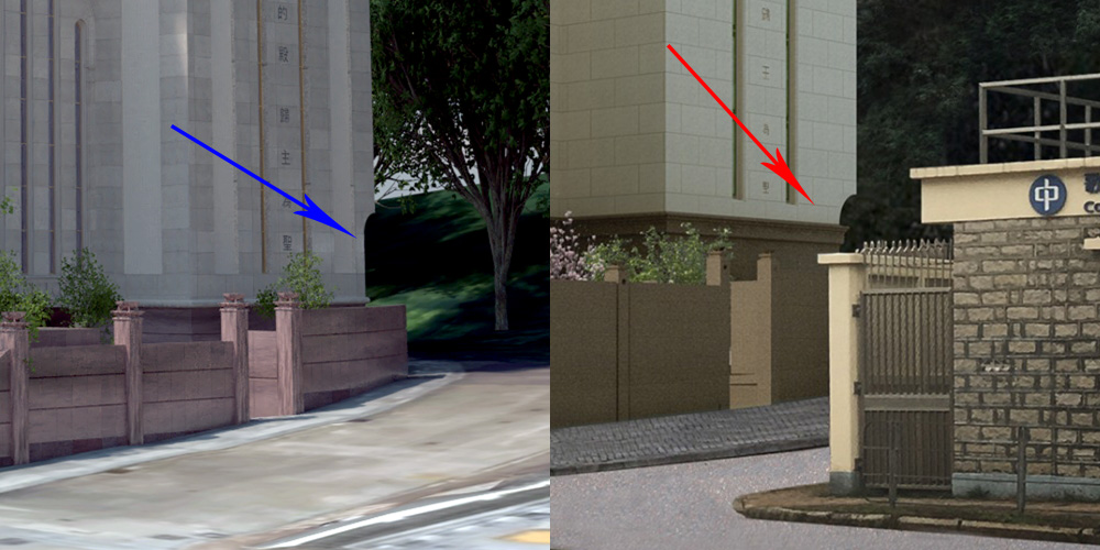
On the back tower, the inscription (I hope I have spelled this right!),
主
的
殿
歸
主
為
聖
Is still in the same spot, but the small pocket windows in the cornice area (blue arrow) have been incorporated into the rest of the window area (red arrow.) This in turn allows the inscription to be more spread out, and taller.
Ground Floor
Currently the Hong Kong Temple has a large open courtyard/atrium area underneath the temple that takes up about half the square footage of the ground floor. In the following image, the outline of the upper (second) floor of the current temple is in blue, and you can see the entrance doors set way back in, with planting and garden areas running around and through the courtyard area:
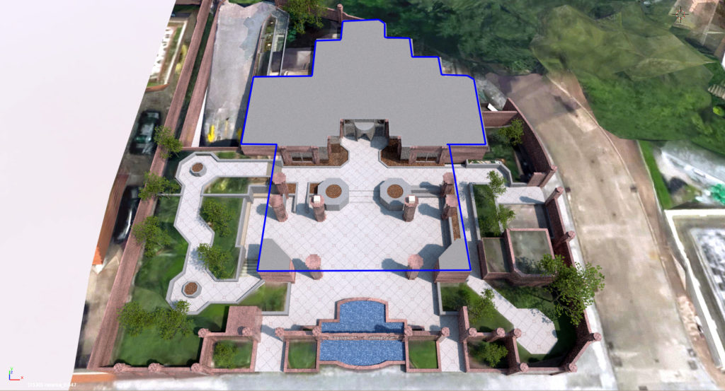
The render appears to show that this original courtyard area (blue arrow) is retained (red arrow)
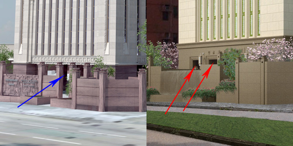
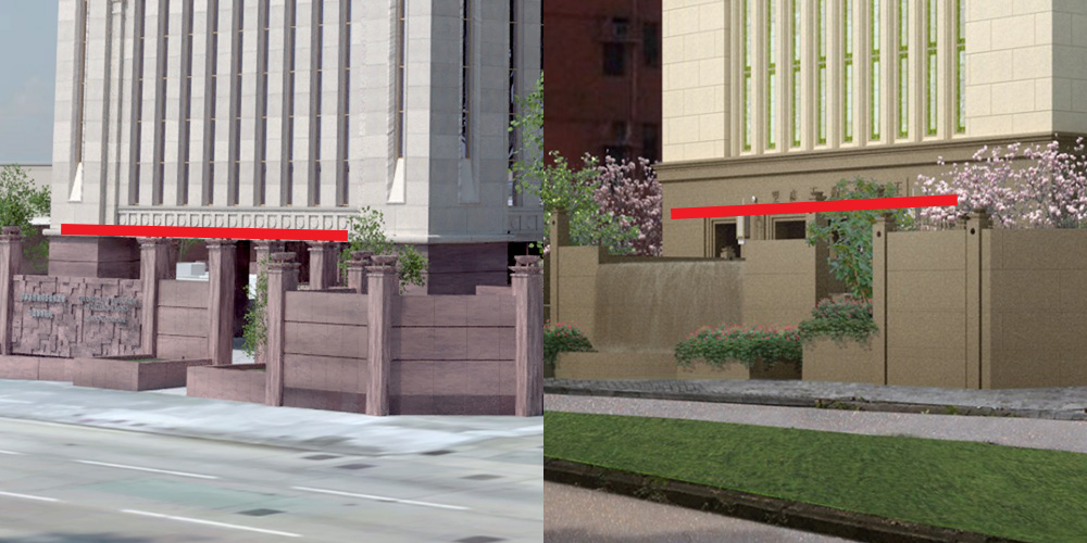
However, the red marble is being replaced with a more sedate brown, and appears to be going higher up the temple than before, eclipsing some of the original windows. Here you can see the original end of the red marble, red line, both sides. The new brown marble goes well above that point, and includes a cornice around it.
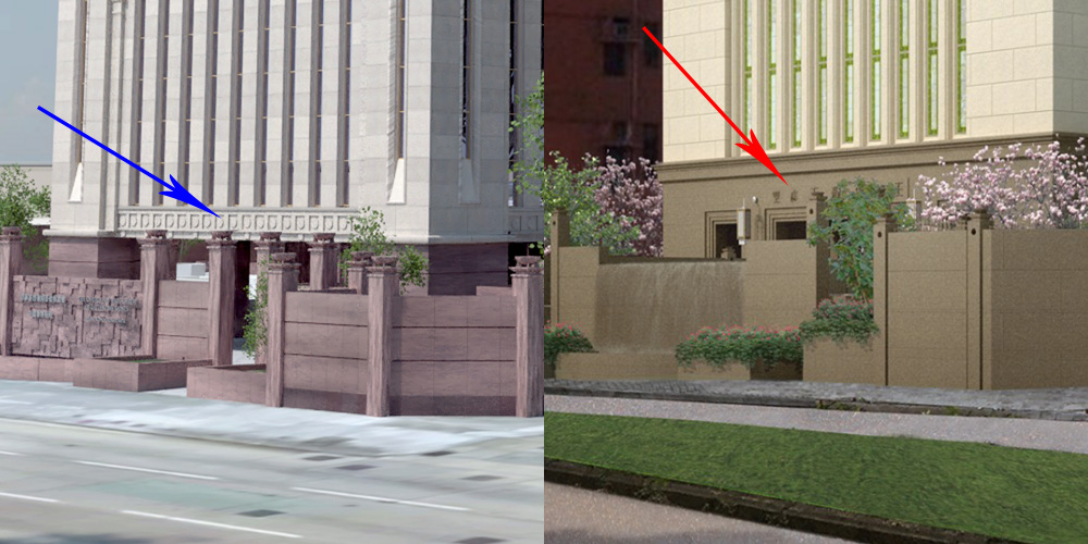
In the old temple, the area of this stone had a circle in a square motif (blue arrow) that was used in many temples of the time period, like Bountiful Utah and Mount Timpanogos Utah. On the new Temple, this detail has been replaced with a second, Horizontal inscription (red Arrow):
主 的 殿 歸 主 為 聖
Going round to the back of the temple, one interesting feature of this temple is that on the ground floor, 2 corners of the ground floor are beveled, because of their proximity to the sidewalk. A curve was added to those corners higher up (blue arrow) to allow the upper floors to take a full 90 degree corner. On the render, this corner serves to show how far up the wall the brown stone has moved in comparison to where the red stone was (red arrow)
The Newsroom article said that changes would be made to the landscaping as well. From the render, the only difference that can be seen is a change to the water feature:
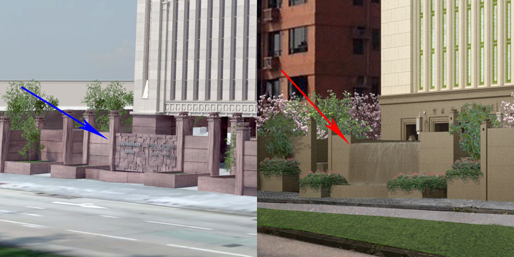
And the color of the boundary wall, which, as in the old temple, matches the cladding of the ground floor.
Conclusion
So there you have it. All in all, the design is simpler than the original on the ground floor, and grows more complex as it goes up the temple. The design itself is a bit more understated and more classically proportioned.
It maintains a feeling of being set apart, without drawing as much attention to itself.
If you happened to notice any details I did not point out that you thought were interesting, feel free to share them below!
Update: Other People’s Thoughts
In a conversation about this temple on Facebook, a friend pointed out that the spire, which was already at the maximum height for the local zoning laws, is short enough that it is nearly impossible to see unless you are more than a block away. To him, it made perfect sense that the spire would be removed for that reason alone. (I would say I have to agree!)
Comments are closed.