Quick update, 2/20/2024: The church announced to day that, upon reopening after the pending renovation, the name of the temple will be Provo Utah Rock Canyon Temple.
If you are not one that pays attention to temple happenings, you might have missed that the Church released an official render for the new Provo Utah Temple. Which, in case you REALLY have not been paying attention, is the old Provo Utah Temple. At the close of the October 2021 General Conference, Church President Russell M. Nelson announced the Provo Utah Temple would be “reconstructed” once the Orem Utah Temple completes construction.
The Orem Utah Temple currently has about a year or so left in construction. That’s conjecture, not inside information.
Hardly was the news of a new exterior look for the temple released, then a petition was started to preserve the exterior of the original temple. The petition hopes that, like the one started to preserve the much older Manti Temple, they can change the mind of those in charge of the project, and preserve at least the unique exterior. Their reasons for the preservation are the temple’s uniqueness, ant the symbolism included in the exterior design.
Now, I have my own opinions on the temple, which I will mention briefly later, but I have begun to hear from various sources that the temple structure might be in much worse condition than that of the original Ogden Utah Temple, the Provo Temple’s former sister temple. The problems with the Ogden temple were so severe, that the necessary fixes required demolishing around 3/4 of the temple’s original structure. The new temple was then built up from there in a floor plan that was only partly similar to the original. If my sources, some of which I feel pretty valid, are correct, perhaps saving the existing structure is not possible at all.
True or not, however, I feel like there is a bit of irony in trying to preserve this temple’s exterior. Why? Well, most of that comes down to the temple’s architect: Emil Fetzer.
On Emil Fetzer
Emil Fetzer was a modernist in his architectural views. What does this mean? Well, for one, he looked to use modern materials. He used shapes that were popular and trendy.
Modernism is all about the here and now. What is current, what is new. But more important to an understanding of what is Modernism, is what it is not. It’s not about Preservation. It’s not about Restoration. Furthermore, it references History only in so far as it is something to be learned from, and not repeated.
So you are now aware that there is a petition to preserve the Provo Temple exterior. And oh, how Ironic it is. We are literally talking about preserving the architectural design of an Architect who did not believe in preservation.
Don’t believe me? Perhaps Emil was only partially modernist? Perhaps he would not want his design removed and replaced? I’m not so sure.
Consider some other temple projects Emil was involved in.
Laie Hawaii
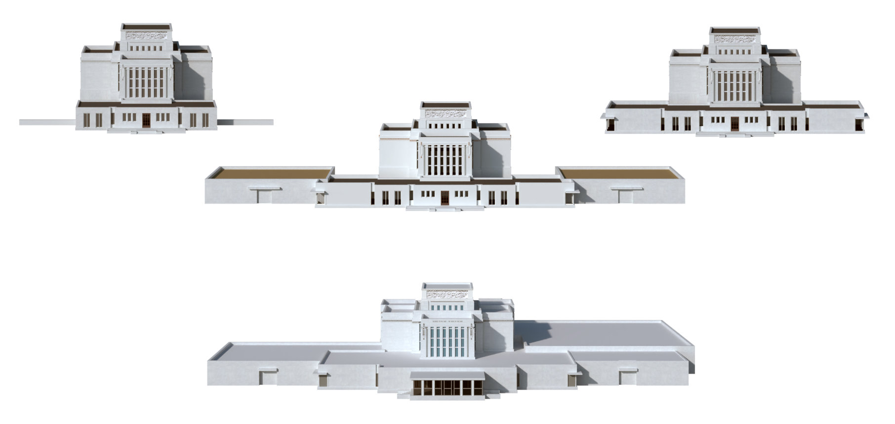
Emil Fetzer renovated the Laie Hawaii Temple. His additions are all on one side of the temple, breaking up 50+ years of symmetrical temple additions.

His plan removed the historic progression from the rooms, and covered up the murals, effectively removing them from the temple until a 2010 renovation brought them back. I have received information that the murals may have been covered at a later date. I will continue to research this point.
Mesa Arizona
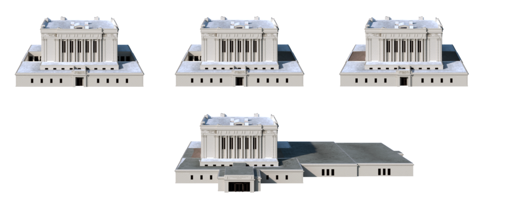
Emil Fetzer renovated the Mesa Arizona Temple, again, converting the historic rooms from progression to stationary presentation. As with Laie, the Mesa Temple additions were all on one side, the south this time. Like Liae, nearly 50 years of symmetry in the design is now gone.

Again, the historic murals are gone at his instruction. Unlike Laie, where they were covered, he had them removed completely, and their spaces covered with a new modern vinyl coating instead. So little care was taken with their removal, that when the decision was made to return the murals to the temple a couple of decades later, only enough of the originals could be salvaged for one wall in each room. Fetzer’s annex, while covered with windows on the outside, has no actual windows in it. As a modernist, Fetzer liked to have full control over the interior lighting.
Idaho Falls Idaho
There is some indication that Emil Fetzer worked with his brother Henry Fetzer on the 1972 renovation of the Idaho Falls Idaho Temple, which again added to just one side of the temple, breaking up the original symmetry. Emil was Church architect at that time, and according to the Church History Library records the addition was designed by Fetzer and Fetzer architectural firm, Henry’s firm.

Update: I have since confirmed that Emil was in Charge of the renovation from the church’s side of things, as he was the Church Architecct at the time.[1]”Five Temples to be Renovated,” Deseret News, Church, 28 October 1972, p4.
St. George Utah
Emil Fetzer was the architect who had the progressive rooms converted to stationary at St. George. Again, all the murals and trim work installed in the rooms in 1937, 35 years earlier, were removed and replaced with modern trims and styles. Fetzer removed the existing annex, and replaced it with a larger, more modern design. As with the Mesa annex, most of the windows on the outside of the annex are fake, Fetzer wanting to control the interior light.
Logan Utah
The project that gave Fetzer a bad name in the minds of many, though, was Logan Utah Temple. The temple had been designed in a way that was just unworkable. It had to be changed. Fetzer gutted the temple, a sad necessity, and rebuilt the interior with all new level floors inside. But, when he decorated the interior, he blacked out all the historic windows, from the inside, again to control the light. He finished the temple with modern trims, modern materials, and nothing that paid homage to the original ornamentation and decoration. In fact, the Baptistry is almost an exact replica of the Baptistries he built into the Provo and Ogden Temples, right down to a recast of the same font and oxen.
So, changing the Provo Temple completely is more in line with the spirit of Fetzer’s work than preserving the temple would be. One could even make the argument he would approve of the changes, as the new design is more modern.
On Provo Temple and Symbolism
Much has been made over the years of the symbolism in the exterior design of the Provo Temple, With the temple base representing the biblical pillar of cloud that led the Children of Israel by day, and the bronze/gold spire representing the pillar of fire that similarly led the children by night.
We talked earlier about what a modernist architect is not. Do you know what else Fetzer did not believe in? Symbolism in his designs. The fact that the temple is a temple is all it needed to be important.
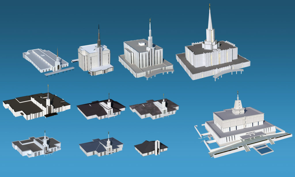
Don’t believe me again? Look at Fetzer’s other designs: Sao Paulo Brazil, Tokyo Japan, Seattle Washington, Jordan RiverAtlanta Georgia, Nuku’alofa Tonga, Apia Samoa (original), Santiago Chile, Sydney Australia, Freiberg Germany… Not a bit of symbolism in the designs. The only design that even comes close to looking like it has symbolism, is the Mexico City Temple, which is a design meant to mimic Mayan and Aztec styles. But that is a style, not a symbol.

In truth, Fetzers first designs for Atlanta and the Pacific temples did not even include a spire, which could at a bit of a stretch be called a symbol or reminder to look heavenward.
The cloud symbolism, intended or otherwise, is long gone anyway. In 2003, the Church painted the golden colored spire white, and added an Angel Moroni Statue. Since that time, there has been no pillar of fire symbolism to be seen.
I have researched the Provo/Ogden symbolism with the staff of the Church History Library assisting. We found NOTHING that indicates Fetzer ever thought anything of the style being representative of anything at all. There has been no indication the symbolism was intentional.
On the other hand….
I was able to track down one individual who interviewed Fetzer before he passed away. When she mentioned she liked the two pillar symbolism of the Provo Temple design, he apparently had little patience for the idea himself, and said that it was not his intention for the design to symbolize that.
So here is something to consider:
If Fetzer did not believe in preservation, and if he intended no symbolism, does that make the existing style of the temple less worth preserving? No change? More worth preserving because so many people embraced the symbolism they saw in the design?
My thoughts on the change
I very much love the original temple, with the golden spire. It was the first temple I ever attended, and it was special to me for years before my appreciation for temples in general fully formed. Some of the magic, so to speak, of that temple went away when the spire was painted white. For me, it’s already not that same temple. I, for one, am okay with the change, but that’s because I am a pragmatist.
The temples are our stewardship, and part of that stewardship means ensuring the temple can fulfill its primary properly. Sometimes, as in the case of the Current changes to Salt Lake and Emil Fetzer’s renovation of Logan Utah Temple, that means drastic changes. And while I may not always be a fan of the way such changes and modifications occur, I understand that we are still learning and growing, both in our understanding of how to build temples, and how to care for them.
So, I do like the proposed design, almost as much as I liked the original look. But I do understand that there are changes that must be made, and that I might not actually ever be informed of the reasons those changes are necessary. So, bring on the future, whatever it may hold.
Last thoughts: Provo Temple’s Efficiency
Now, if all you came for was an opinion piece on the temple’s renovation, you can stop reading now. The rest of this is just informational.
I keep hearing much said about the Provo Temple’s efficiency. It is often said with a slight edge of awe. I usually find that most people don’t actually know what that efficiency entailed, or mis-assign the trait to another aspect of the temple. So for clarity’s sake, I would like to talk about what does make the current floor plan such a groundbreaking design.
The round design
The one thing people know about the floor plan is that it is round. Or somewhat round. Or sort of Oval. And this is the feature often touted as being so efficient. It’s not.
There is a story told in the 1972 Ensign about how the design was made efficient through inspiration while on an airplane flight. The story is worth a read, so go check it out:
That article also happens to be the source of the much quoted statistic that, at one point (1966), 52% of all ordinances were done in just three temples (out of 13 total.)
Should you choose to read the article, you will realize that the famous inspiration was over how to lay out the rooms, and not the use of what Brother Fetzer called the “Danish Ellipse.” The elipse is what gives the temple it’s great rounded corners. But the layout give the efficient flow.
You see, on that flight, Brother Fetzer and his companion, Fred Baker, realized that they could greatly increase the traffic flow through the endowment rooms by arranging them 3 on one side of the celestial room, and three on the other. Oakland already used a mirrored approach, with one room to either side. The epiphany came in giving each side of the celestial room a shared ordinance space, known as the veil space, that spanned across all 3 rooms. As long as ordinance start times were staggered, so that the first session started on one side (just for example’s sake, let’s say an east side room,) and the next session was held on the opposite side (in a west side room,) then when it came time to use the veil space, each room could in turn use the whole length of the space without running up against traffic coming from other rooms.
This layout worked extremely well. So much so that in the first month of operation, each of these two temples was apparently able to do more endowment ordinances by itself, than the 4 busiest temples in the world at that time combined.
If you have ever done an endowment ordinance in that temple, however, you will remember that, while sitting in your instruction session, you can plainly hear the other sessions using the veil space. It was efficient, but kind of noisy!
That efficiency has since been adapted to most temples, (and even been improved upon in most modern temples.) Fetzer himself used it in Jordan River, Seattle, Mexico City and Atlanta, those designs big enough to have at least 2 rooms aside. Indeed, the Jordan River Temple floor plan is very much a larger version of the Ogden/Provo plan. As such, any renovation that changes the current layout of those rooms is not going to permanently destroy the lesson in efficiency learned there.
Related Article: The Sad Tale of the Logan Utah Temple
References
| ↑1 | ”Five Temples to be Renovated,” Deseret News, Church, 28 October 1972, p4. |
|---|

Excellent article, Brian. Provo has worked on the sound issues at the veil. It’s a rare event when I hear anything outside of the endowment room, but for sure that has not always been true. I’m not sure what changed, but something changed.
Good to know that they have improved it. I have not lived in the Provo Temple District for some time, so I did not know if they had fixed it yet or not. As of the late 90s, early 2000s it was still pretty bad.
Excellent article. Many good points.
One comment: The Kimball-Fetzer remodel of the Laie Hawaii temple did not cover up the murals. I was living in Hawaii 1984-88, and the murals were there for all to view. It was a stationary endowment session with film, but the murals were there. Laie did not suffer the same fate as St George and Mesa in that regard.